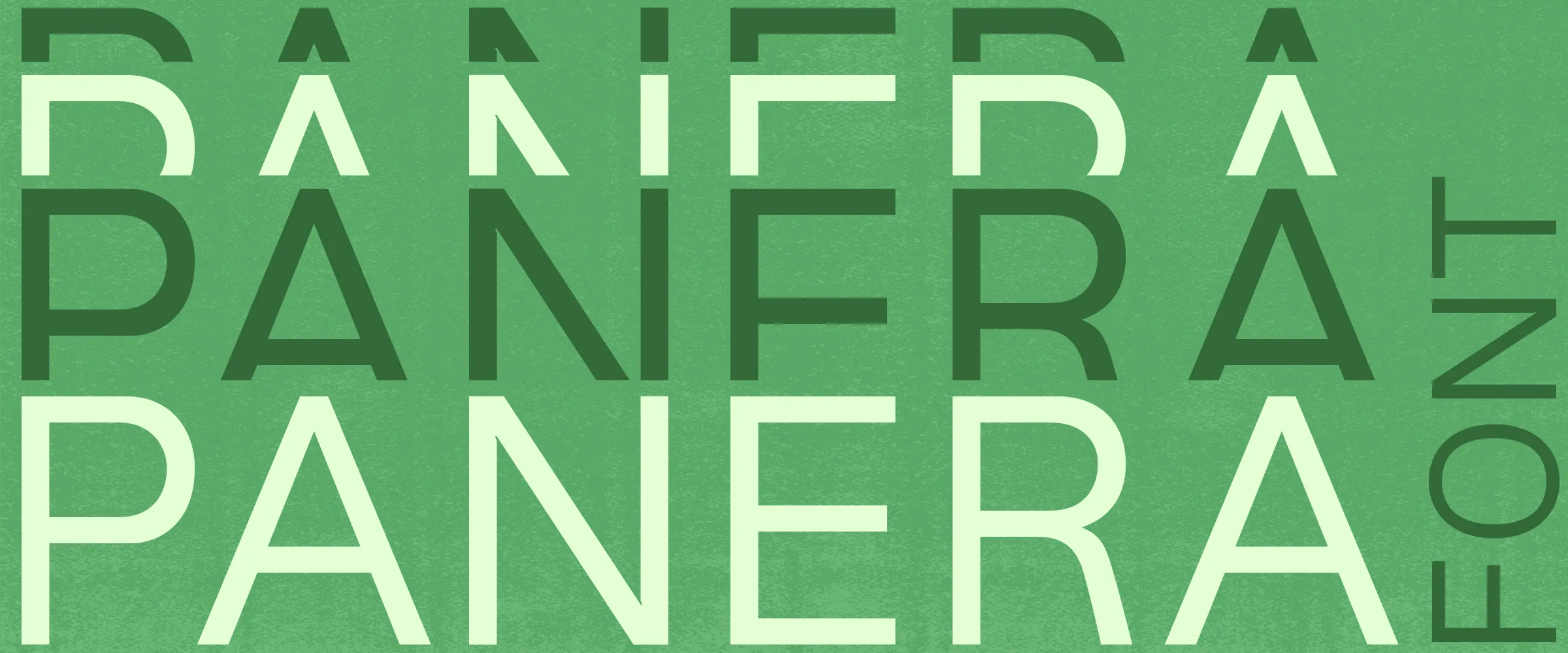
Panera
Original Typeface — Work In Progress
Panera is the first typeface designed by Kensuke Sato.
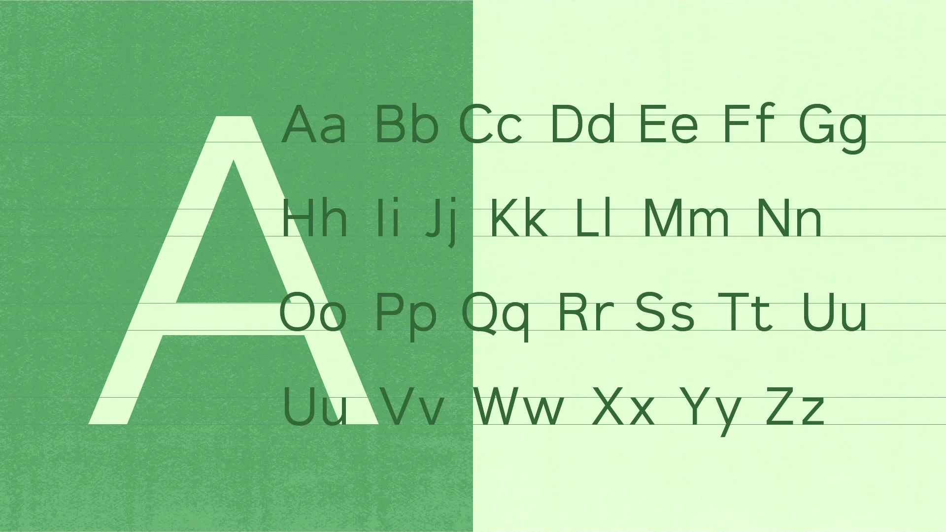
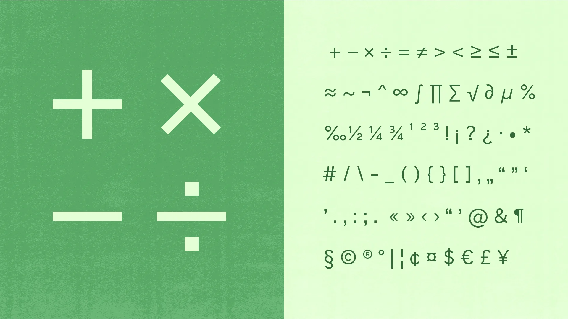
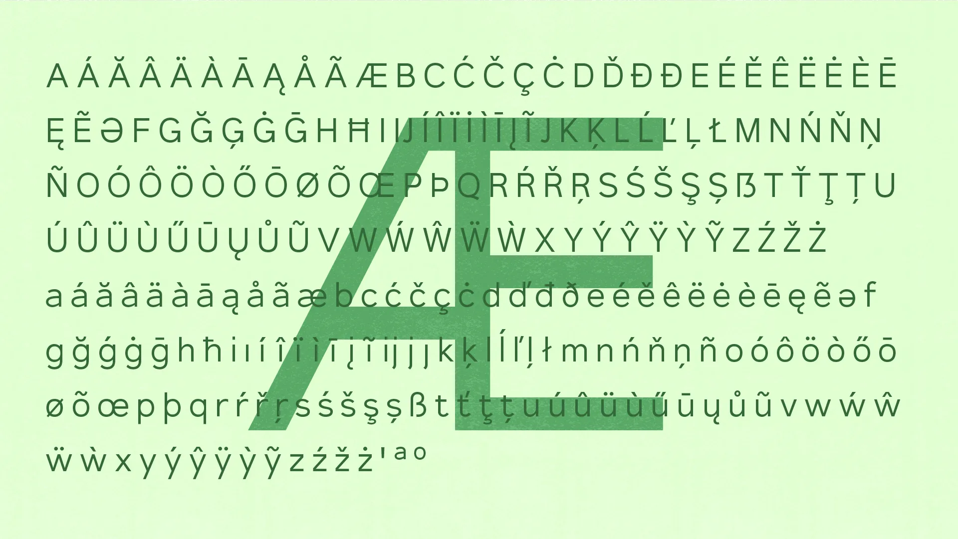
It is a sans-serif typeface created to quietly support information while avoiding unnecessary personality. Neutral in tone yet softened by a balance that resists excessive geometric rigidity, it adapts naturally to a wide range of applications—from long-form text and UI design to branding. Rather than drawing attention to itself, Panera is designed to gently enhance the contours and atmosphere of the content it accompanies.
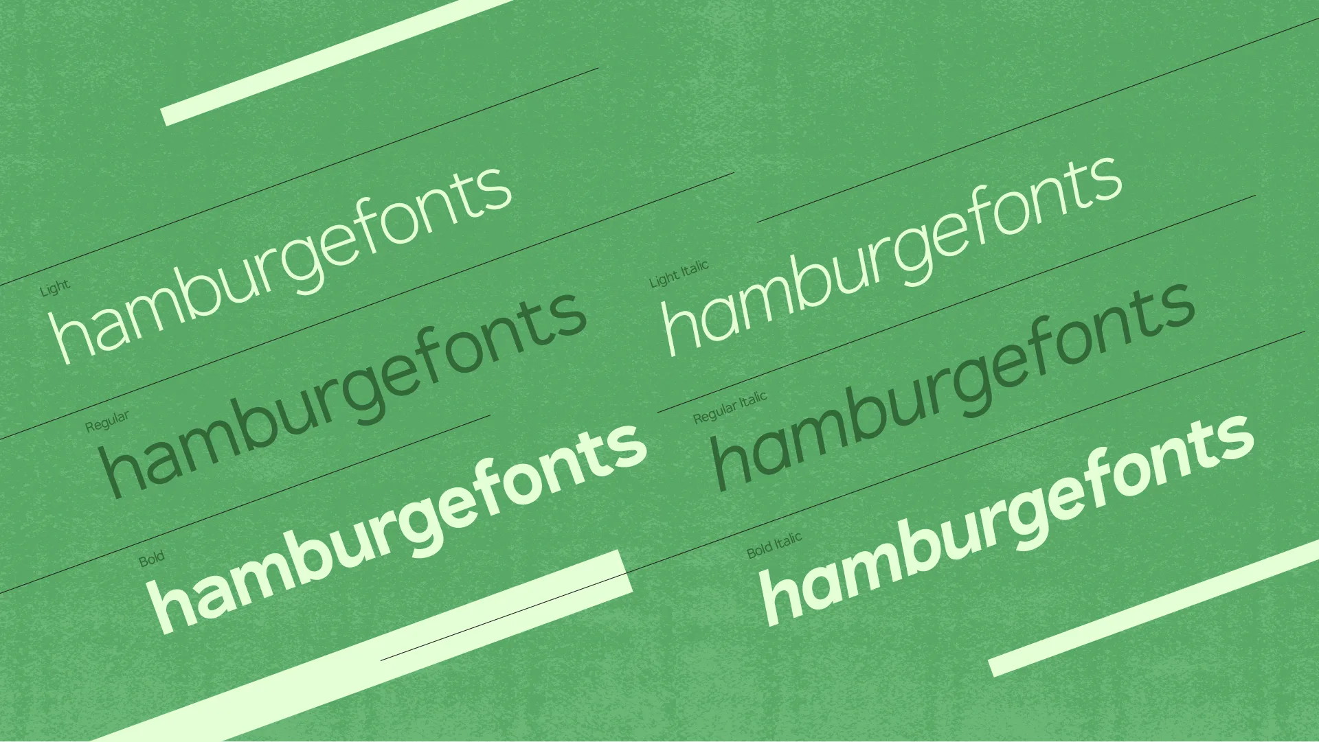
At the moment, most of the Regular weight glyphs have been completed, while work continues on expanding the family with Light and Bold weights, as well as italic styles.
Why is it called Panera? Because most of the earliest glyphs were designed at Panera Bread.